Development Log #2: Building the User Experience
Our team has begun working on the in-game experience which players will expect to see in the final game.
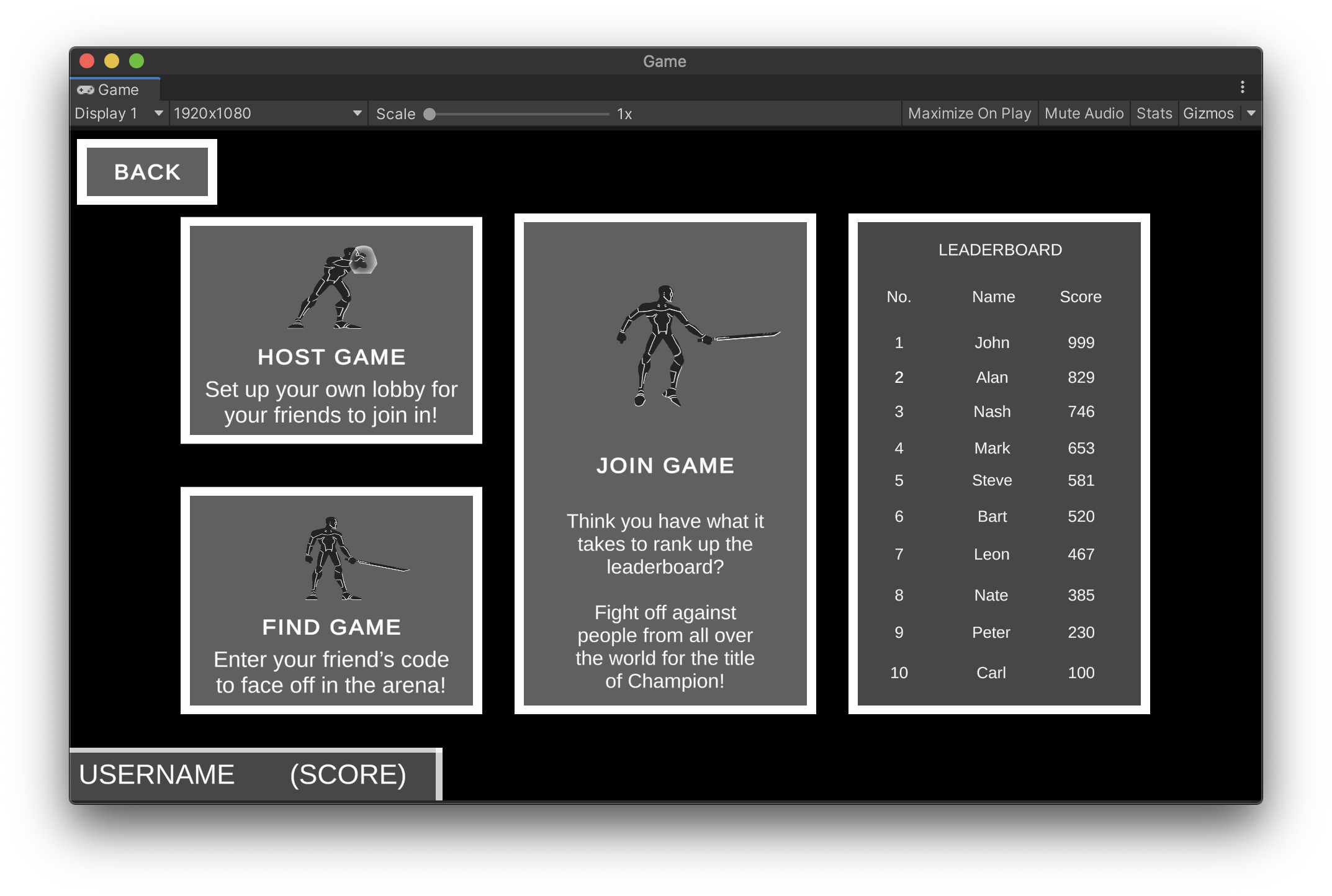
Along with network functionality getting started, the layout of the main menu has been completed and is designed to offer a similar experience for both PC & Mobile players through its tile-based interface. Players will be able to host their own matches, find their friends' or join ranked battles for a chance to go up the leaderboard.

The poses for each action are currently being made with players being able to move, attack, jump and shield themselves from incoming attacks. In terms of art, the different colours for the players to choose from for their character have been confirmed; red, orange, yellow, green, blue, purple, magenta and white. Upon defeat, the character would dissolve into the air with their particles representing the color chosen by the player.

Hoping to show you all a first look at gameplay very soon!
Get Sole Slash
Sole Slash
A one-hit online multiplayer teleporting neon fighter.
| Status | Released |
| Author | Sole Slash Studio |
| Genre | Fighting |
More posts
- Development Log #X-Mas: Final Release and SAE Virtual Showcase!Dec 26, 2020
- Development Log #9: Game is Released in Early Access!Dec 17, 2020
- Development Log #8: Release Date Announcement and Audio Update!Dec 10, 2020
- Development Log #7: Entering Post-Production!Dec 03, 2020
- Development Log #6: Character Reveal & Character Customization!Nov 26, 2020
- Development Log #5: Multiplayer Updates and a Surprise!Nov 19, 2020
- Development Log #4: Expanding the GameNov 12, 2020
- Development Log #3: Preparing for TestingNov 05, 2020
- Development Log #1: Introducing Sole Slash!Oct 22, 2020

Leave a comment
Log in with itch.io to leave a comment.